Choosing wedding colors can feel like picking the personality of your entire celebration, and pink wedding palettes give you so much room to play. I love that pink can lean soft and vintage, bold and modern, or completely glamorous depending on the colors beside it.
Current wedding palettes are moving toward combinations with more depth, layering romantic shades with metallics, rich tones, and nature-inspired colors instead of relying on a single pastel shade.
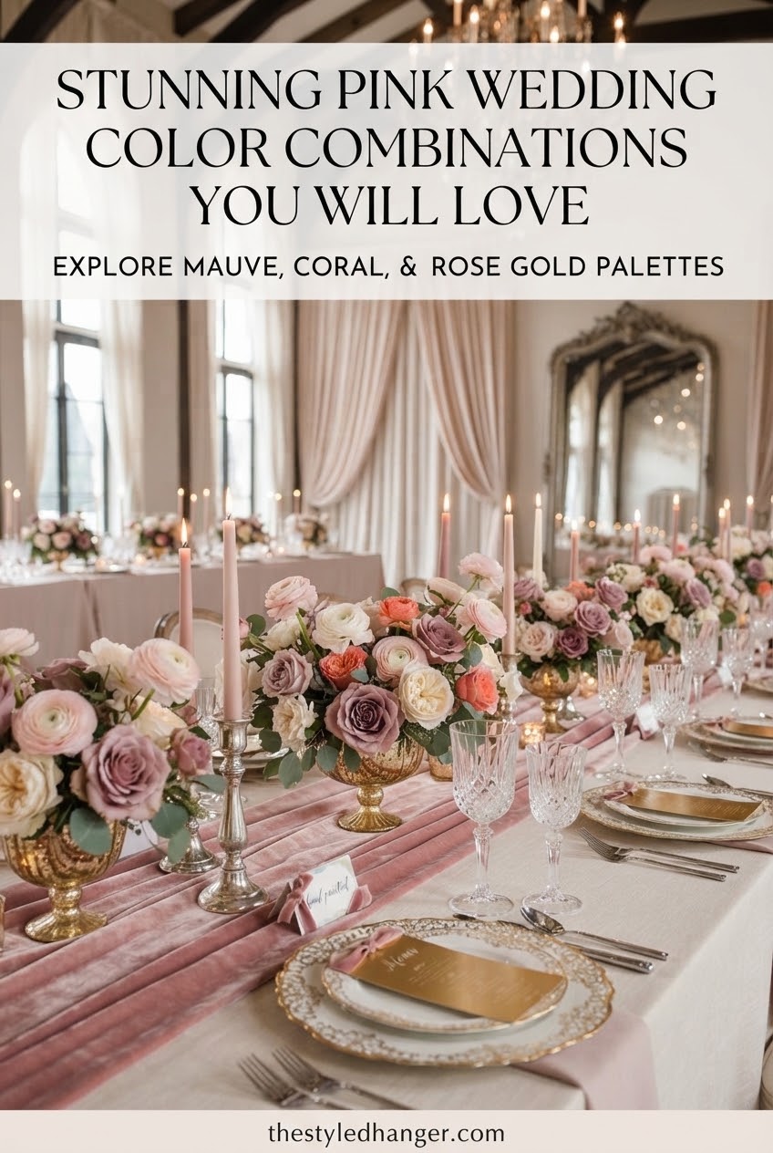
Pink and Gold Wedding Color Combination
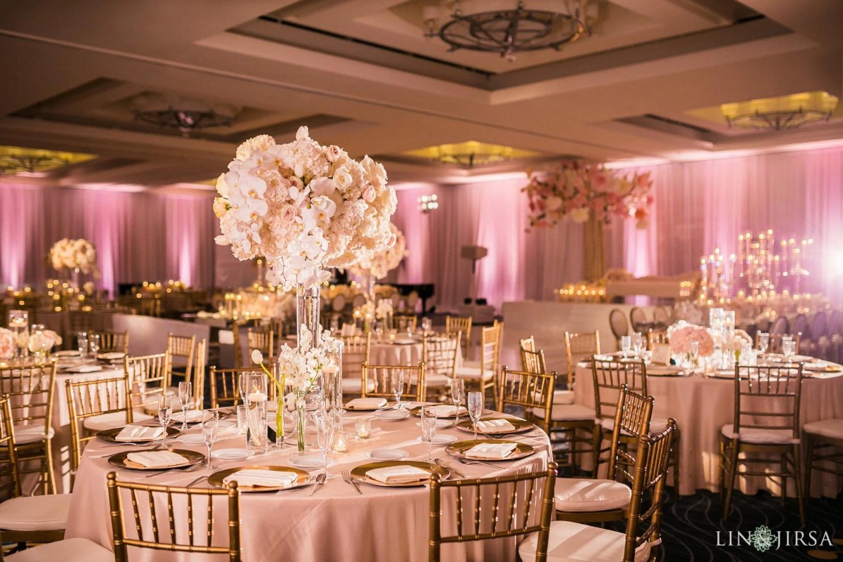
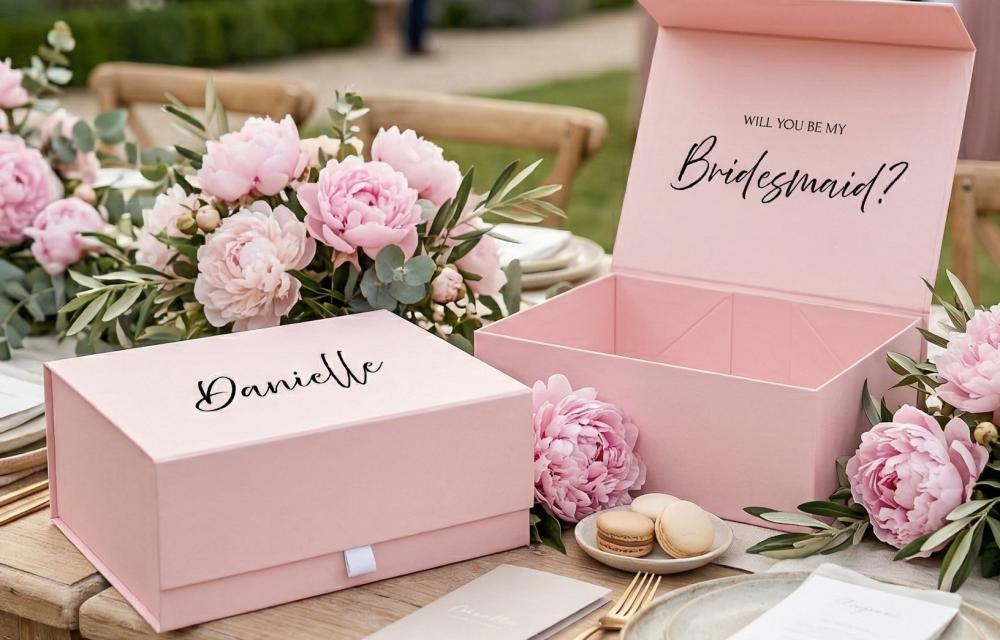
I always think of pink and gold weddings as the little black dress of wedding palettes: classic, polished, and hard to get wrong. Gold adds warmth to pink flowers, invitations, and table details without making the look feel too sweet.
For a balanced design, I like using blush as the main color, gold as the accent, and ivory as a quiet background. This warm combination continues to appear in modern wedding inspiration because metallic touches create a luxe finish.
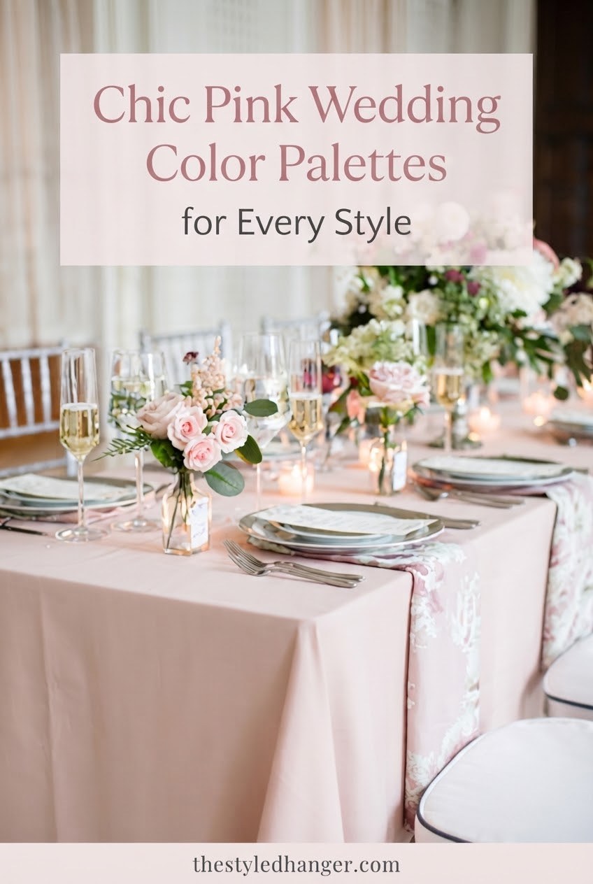
Blush Pink and White Wedding Color Combination
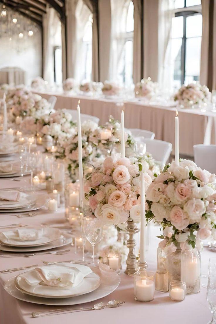
Blush pink and white is the palette I recommend when someone wants timeless romance without feeling overly themed. It photographs beautifully because the colors create softness while keeping the space bright.
I love adding texture here with different whites, silk ribbons, and layered flowers so the palette feels intentional instead of flat. Pastel combinations remain popular because couples are using them in more sophisticated, layered ways.
Styling tip
Mix warm white details with blush instead of matching every piece perfectly.
Pink and Green Wedding Color Combination
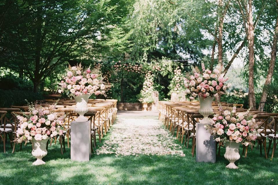
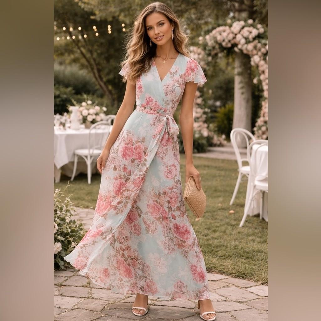
Pink and green is the combination that instantly makes me think of a garden ceremony. The fresh contrast between pink flowers and greenery keeps the design romantic but grounded.
I especially love this palette for outdoor weddings because eucalyptus, olive branches, and leafy textures give pink a more modern feel. Green continues to be a major wedding color choice, often appearing alongside softer romantic shades.
| Pink shade | Green pairing |
|---|---|
| Blush | Sage |
| Rose | Olive |
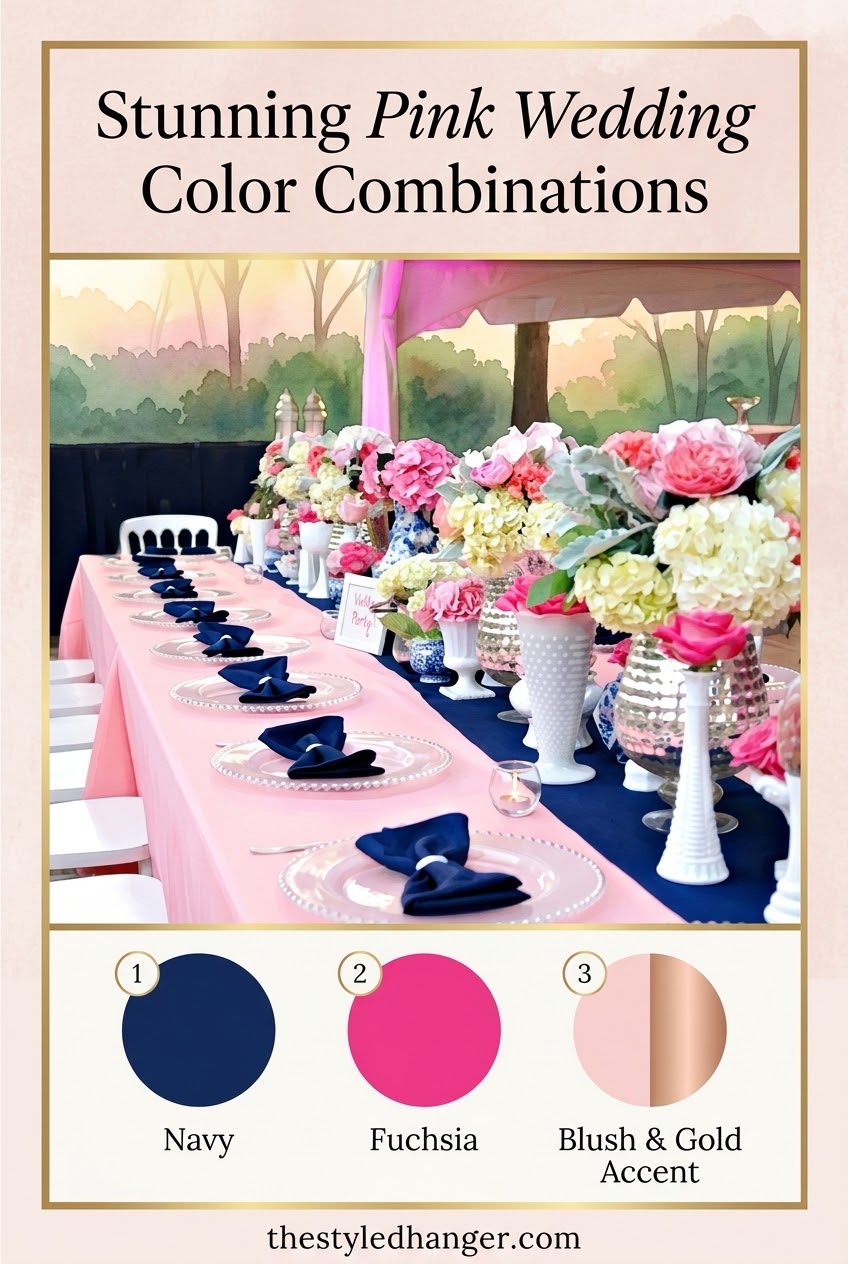
Pink and Navy Blue Wedding Color Combination
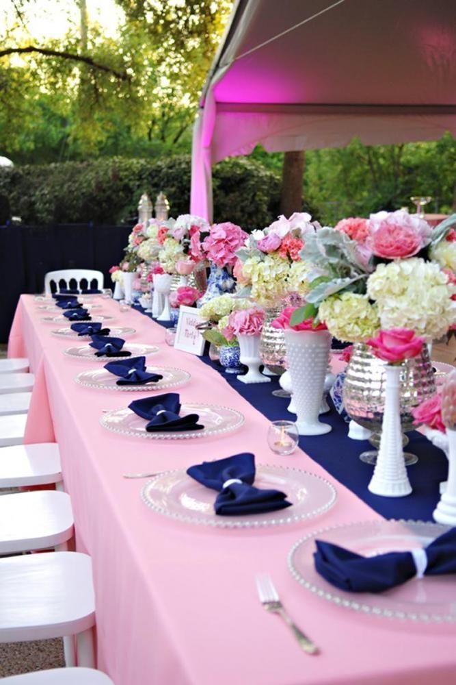
When I want a pink palette to feel more tailored, I reach for pink and navy blue. Navy brings structure, making this pairing work beautifully for formal venues, evening receptions, and classic wedding parties.
I like letting navy appear in suits, stationery, or table accents while pink stays in the florals. This combination is often highlighted as a versatile wedding pairing across seasons.
Why it works
- Creates elegant contrast
- Works for many venues
Watch for
- Too much navy can feel heavy
- Balance with light details
Pink and Champagne Wedding Color Combination
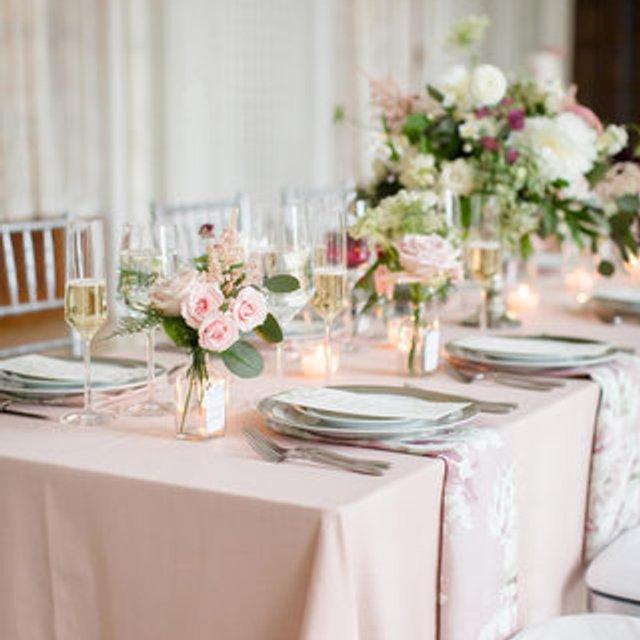
Pink and champagne feels like candlelight in color form. I love this pairing for couples who want something romantic, understated, and elegant without a lot of contrast.
The easiest way to style it is by layering champagne fabrics, pink flowers, and neutral stationery. Warm champagne and soft romantic tones remain popular choices for refined wedding designs.
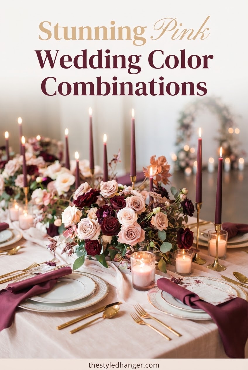
Pink and Burgundy Wedding Color Combination
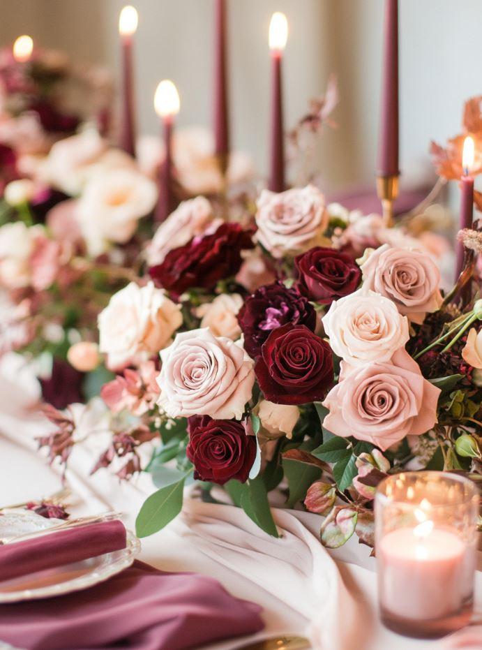
I love pink and burgundy weddings for fall and winter celebrations because the deeper shade gives pink a dramatic, romantic edge. It feels especially beautiful with velvet textures and candlelit spaces.
For a softer result, I mix burgundy blooms with dusty rose instead of using only dark tones. Rich jewel shades and burgundy combinations continue to show up in modern wedding palettes.
2 tones
Pink and burgundy can create depth without needing many extra colors.
Pink and Lavender Wedding Color Combination
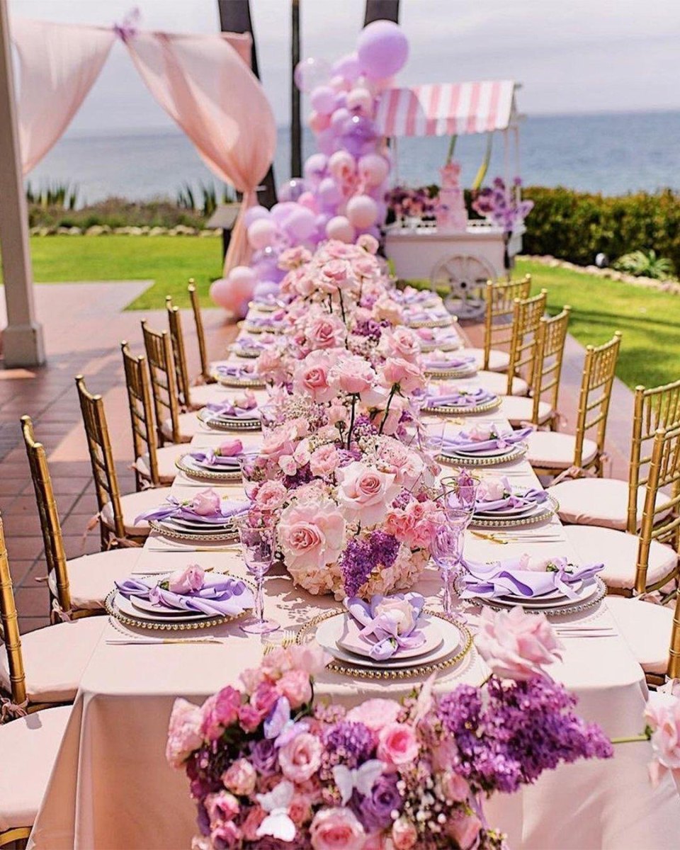
Pink and lavender is the palette I picture for a whimsical garden wedding. The two shades blend naturally because both bring softness without competing for attention.
I like adding white flowers or silver accents when styling this combination so the colors feel fresh rather than overly pastel. Lavender remains a popular romantic wedding shade paired with soft neutrals and metallics.
Pink and Black Wedding Color Combination
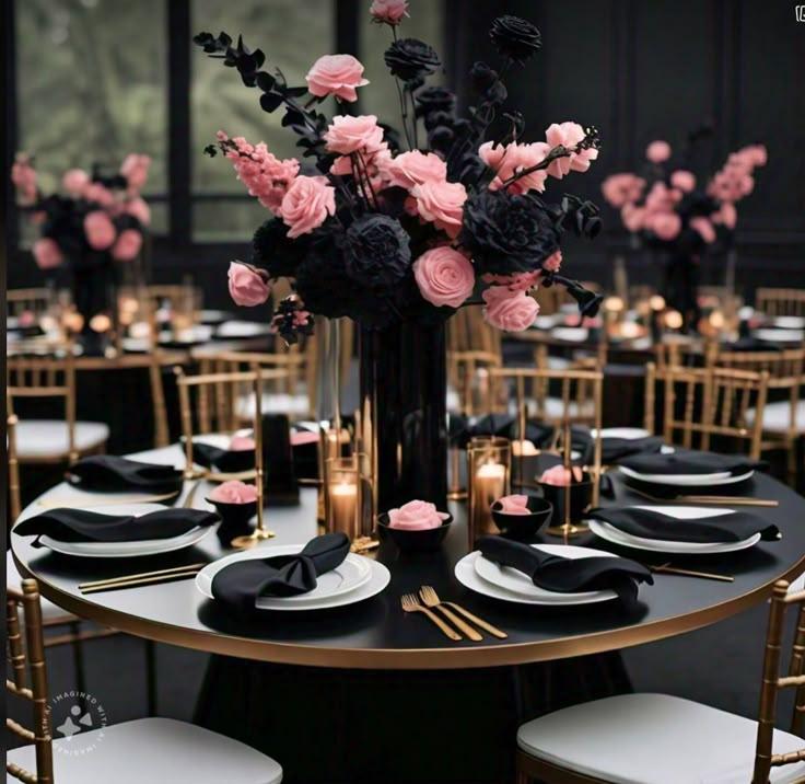
Pink and black is where I go when someone wants romance with a little edge. The black and pink contrast feels editorial, especially with sleek invitations, modern florals, or evening lighting.
I would keep black as the accent rather than the majority color unless you are intentionally creating a dramatic look. High-contrast palettes are increasingly being used to create more personal wedding designs.
Small detail idea
Try black ribbon, menus, or candle holders instead of overwhelming the whole room.
Pink and Silver Wedding Color Combination
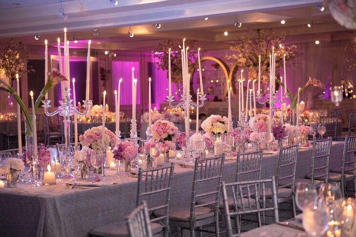
Pink and silver weddings have a graceful, almost wintery elegance. Silver cools down pink beautifully and works especially well with crystal details, metallic stationery, and soft lighting.
I love this pairing when the goal is modern romance rather than traditional warmth. Silver is often used with cooler wedding palettes because it creates a clean, polished effect.
The best wedding palette is the one that still feels like you when the trend boards change.
Camille Rhodes
More Pinterest Visuals